For the sixth Design Blogger Series: What Would You Do?, I invited four talented design bloggers - all of whom have up incoming careers in the design field. Michaela of Michaela Noelle Designs, Kerry of First Time Fancy, Marissa of Roost, and Mackenzie of Design Darling were asked to design a space around the sleek, white lacquer console by Jonathan Adler by incorporating four or so home décor items of their choosing.
Made in Vietnam using traditional, artisanal techniques, the “minimalist sparkle” Jonathan Adler console is coated in twelve layers of lacquer. It is quite a process; Every coat is allowed to dry for 48 hours and water-sanded before the next coat is applied.
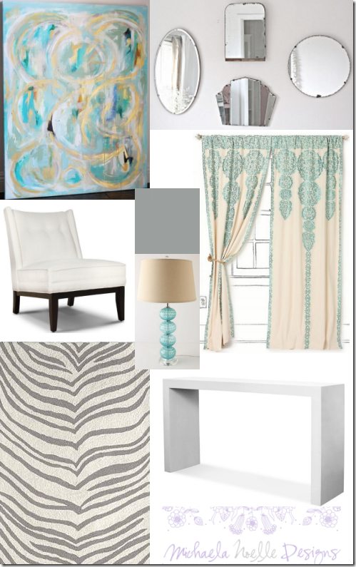
{Foyer by Michaela of Michaela Noelle Designs}
“My style is a mix of modern and vintage, so I knew I wanted to add a touch of vintage with the juxtaposition of a few whimsical items. I can see this console table in a foyer. I imagine the walls painted this cool shade of gray {Benjamin Moore's Cobblestone Path} to add just the right amount of contrast between the white items and the walls. A classic zebra patterned rug in gray and ivory will cover the floors. The curtains are consistent with the geometric shape of the console, but also point to a more vintage feel with the addition of the turquoise organic swirls. An echo of the turquoise is found in the lamp to be placed on the console. The modern white chair will sit to one side of the credenza, providing a chic place to slip on your shoes before you head out. To brighten up the space, above the console I would layer an oil painting from Jen Ramos with an eclectic, mismatched mirrors ...and let's be honest, we all want to check our lip gloss one more time before running out the door!”
* Simplified Bee’s favorite thing about Michaela’s design: the oil painting by Jen Ramos.
 |
| {Nursery by Kerry of First Time Fancy} |
“Most of the time, if you give someone a console table, they will automatically think entryway or living room. Maybe it's because I have some serious baby brain recently, but I put together a sweet little nursery using the lacquer console. I picked the Jennifer Delonge Glam Glider because I love the simple lines of it, and think it looks like the perfect spot to curl up with a babe in the wee hours of the night. The Aerial Crib mimics the same clean lines, while the Tiger Boo rug brings some fun and colour to the space. Then, to give the console purpose in the space, I picked the Jonathan Adler Giraffe Lamp to go on top, and some Pottery Barn canvas buckets for storing baby toys underneath. If we had, had a bigger budget for our own nursery, I am sure at least a few of these pieces would have made their way in.”
* Simplified Bee’s favorite thing about Kerry’s design: thinking out of the box and placing the console in a nursery!
{Foyer by Marissa of Roost}
"I am usually drawn to pretty traditional design, so it was fun for me to step out of the box to use this cool modern console in my imaginary entryway design! I started with Navy Bean Grasscloth from Phillip Jeffries. Grasscloth is so classic and works well with a lot of styles. In my imaginary entry, there is a nice big set of windows, which I would frame with Lyrical Branches Curtains from World Market. A lot of the other elements I chose for this room are very symmetrical and/or geometric, so I like the flowing, organic lines of the branch pattern. Under foot, I chose the grey Riviera Rug from Calypso St. Barth, and overhead, Troy Lighting's amazing Sausalito Pendant. I love gold accents--so glamorous and refined. Under the console, more gold with a pair of Circe Benches with Greek key detail, which I'd reupholster in Tapdance by Stout Fabrics, available at Decorator's Best. I love mirrors in entry ways (or anywhere, really), and I chose Horchow's Bone Inlay Mirror as the statement piece for this entry. I can't get over how beautiful and intricate it is! This is a pretty pricey little design, but a girl can dream. Or surf Craigslist to DIY some of it myself!"
* Simplified Bee’s favorite thing about Marissa’s design: it’s a toss up between the bone inlay mirror and the Greek key bench.
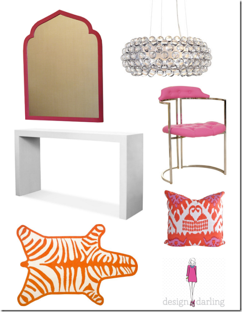
"I love Jonathan Adler having interned for him last summer so this challenge was a real treat! I envision his divine lacquer console in a playfully chic foyer. My first move is to soften its straight lines with a curvy framed mirror and to-die-for vintage chairs. His traditional-with-a-twist zebra rug is a must and I love that the Quadrille Kazak pillow ties in both the orange and the hot pink. Topped with a sparkly chandelier, it's everything a preppy foyer should be!"
* Simplified Bee’s favorite thing about Mackenzie’s design: the pillow in Quadrille Kazak {swoon} – it pulls it all together beautifully.
Don’t you love what these gals have created? Each of these spaces has a distinct feeling, but I couldn’t help but notice the similarities: 1. Three out of the four used the lacquer console in a foyer, 2. Three out of the four coupled it with an animal print rug, 3. All paired it with a upholstered chair or bench, 4. All incorporated lighting that makes a strong statement. What similarities or differences do see?
Also, a big thank you to Michaela, Kerry, Marissa and Mackenzie for participating in this series!


No comments:
Post a Comment