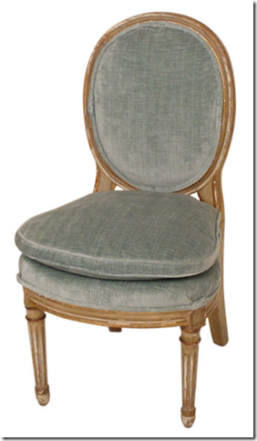
Today I am thrilled to have four more very talented interior design bloggers participate in the fifth, Design Blogger Series: What Would You Do? Jenny Komenda of Little Green Notebook, Caitlin Creer, Katie Denham of katiedid, Staci Edwards of {Inspired by Life} were asked to design a space using this Louis XVl style slipper chair:
It's a fabulous chair circa 1920 from France found on 1st Dibs. This classic chair could go in just about any room, so I was excited about how the designers would use it.

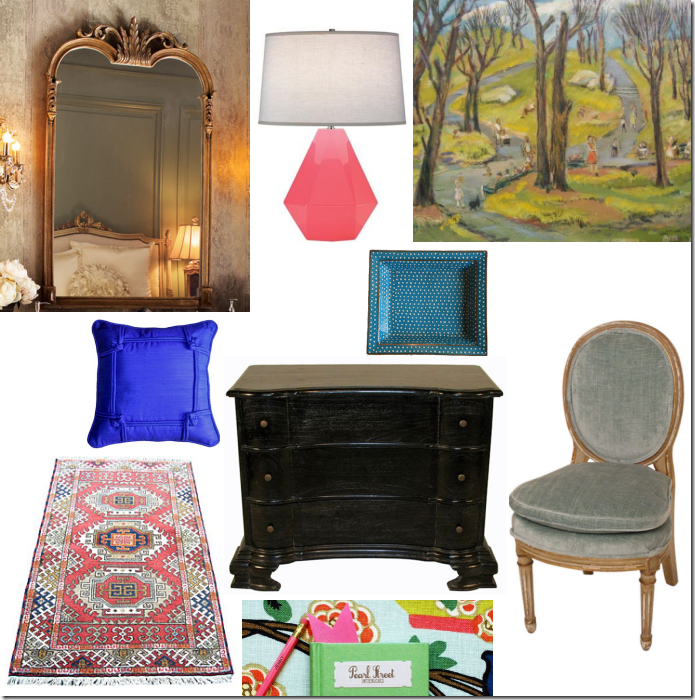
Founder of interior design firm, Pearl Street Interiors and the blog Little Green Notebook, Jenny Komenda has this to say about her design incorporating the Louis XVI slipper chair: “I have a pair of small slipper chairs that I'm considering using in my entry, flanking my console, so I thought it would be fun to pretend we have two of these gorgeous chairs and also use them in an entry or foyer. I love to mix different styles of furniture and I'm a firm believer that the key to a well-decorated room is finding balance. The slipper chairs are a bit on the delicate side, so I think I would use something bold and heavier as the console. You could find an inexpensive vintage piece to paint out black and add pretty brass hardware, but if you're not into DIY, this (somewhat pricey) piece by Noir furniture is amazing. Trust me - it knocks your socks off in person. I'd top it off with a Frenchie/Italian looking mirror like this reasonably priced version from Horchow (if the craigslist gods are not smiling on you). Try leaning a framed piece of art against your mirror. I recently found an old etching of our NYC neighborhood in an antique store. I have it in our entry and I love that it's one of the first things people see in our home. Sort of an outside meets the inside kind of thing. Even if you don't live in a big city, try searching for old maps, paintings or photographs of your town on eBay or Etsy and I think you'll be surprised what's there. For my Upper West Side friends, check out this pretty painting of Morningside Park. These new lamps from Robert Abbey are going to be a HIT in the blog world. Available in all sorts of colors, they feel like the rebellious granddaughter of traditional ginger jar lamps we all know and love. This spotted tray was absolutely meant to be paired with that lamp. And what entry would be complete without a fabulous rug? If you're not interested in scouring eBay for the perfect oushak or Turkish number, this rug from Overstock is lovely. See those little bits of blue? Bring it all home with a petite electric blue silk pillows for a pop on one of the slipper chairs.”

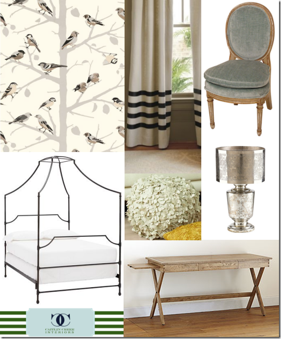
Salt Lake City, Utah designer Caitlin Creer says, “The moment I saw this chair I was instantly drawn to it's classic elegant feeling. I don't get to do a lot of teenage rooms but I dreamt up a stylish and sophisticated space for a teenage girl. I'd use our beautiful chair as a desk chair and pair it with this beautiful desk from World Market. Against the main wall I'd use this amazing A-Twitter wallpaper from Schumacher (it can be purchased from Decorator's Best) for some impact. Four our bed, I'd go for something simple that will really let the wallpaper be the start of the show. I'm thinking this maison canopy bed from PB Teen should do the trick. I've also had my eye on these gorgeous striped panels that would play beautifully off of the wallpaper.
Just because this is a girl's room and it needs some feminine touches, we'll throw in a pretty floral pouf, and a sparkly lamp. Now I just wish this room was in my house!”
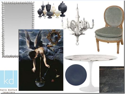
Designer Katie Denham based in Sacramento, California says this about her design, “I have put together a Dining Room which combines a bit of modern with a bit of moody fantasy from times past. I love to use modern furniture in a traditional setting or traditional furnishings in a modern setting. In this case, the setting would be a traditional wood paneled room with old oak floors. I imagine one wall punctuated with large Palladian multi-paned arched windows. I took a cue from the blue velvet fabric on the chairs and expanded on a color scheme using a darker blue paint for the paneled walls from Devine Color. I wanted to create a shell of darker tones and contrast that with punches of white. So, to begin, I picked oak floors with a brushed black stain to keep the background darker. They add texture and have an aged quality. For the contrast in mood and color, I picked the white marble topped Saaranin table from DWR. And around which would be six of the Louis chairs Cristin picked. (Lovely!) White Paper Chandelier from Moooi available through Lumens. I think it is a witty take on a more traditional chandelier...very fun. For the walls, a large white plaster looking mirror...total fantasy....from Oly Studio. And for art, a monumental piece from Cosgrove Art. This piece is so dramatic and another nod to fantasy, ad the velvety blue colors are perfect. I also added these black and white onyx vessels from Oly Studio en masse for on top of the table. Oly Studio is available through Ruby Living or Jayson Home and Garden. There are also lots of retail stores available from the Oly Studio.
Thanks again, Cristin, for including me! It has been a pleasure.”
Ontario-based interior designer, Staci Edwards explains, “As soon as I saw this beautiful slipper chair I thought: seeing as I will probably not have my dream dressing room anytime in the near future, it would be fun to create the look here! The room would have warm white cabinetry throughout, and the back wall would be a feature wall, where these items would be… First, I would get the chair refinished by painting the show wood in Farrow & Ball’s Pitch Black, and reupholster it in this stunning ikat inspired print called Peacock by Trina Turk. Keeping with the 1920’s French feel of the chair, I chose this darling Avery Bombé Chest from Crate & Barrel {a cute feature to this piece is that the drawers are lined with hand-silkscreened paper, that would make me smile each time I opened them}. This stunning fashion print by David Downtown would be hung directly above the dresser with major matting in an oversized frame. Hanging from the center of the room would be this stunning Morris Ribbon Pendant at Studio B, the diffused light will create a very feminine feel, and I like how the ribbon pattern mimics the shapes in the fabric – a perfect “tie” in {pardon the pun}. Underfoot will lay this beautiful Faux {because it’s more friendly that way} Faux Zebra Hide from Jayson Home & Garden, which would ground the look while creating visual interest. And there you have it: my dream dressing room using the slipper chair provided – I hope you enjoyed it, and thanks to Cristin for inviting me to join in the fun!”
A huge thank you hug to designers, Jenny Komenda, Caitlin Creer, Katie Denham, and Staci Edwards for participating in this series. I love what you created and all very different spaces. Brilliant!


No comments:
Post a Comment